IDEO Colab
Designing a waste-free food delivery system
Overview
During the last weekend of October 2019, I was given the opportunity to spend a day at the IDEO Colab Makeathon. This was a chance for me and the other sixty-or-so participants to work together to gain experience with IDEO’s design process, to prototype for interesting challenges, and to just spend a day around other creatives.
As for my team, I was paired up with three other people; a masters student at USC studying computer science, a graphics designer working at Hollister, and a former CEO who had worked in the medical field for over twenty years. We had a diverse range of skills and knowledge shared between us and we were all excited to tackle the design challenge; we also were accompanied by two employees from IDEO Colab who helped mentor us during the event.
For our group, IDEO Colab wanted us to focus on Wasteless Food Delivery; our goal was to create a new circular (and waste-free) food delivery service designed for urban apartment buildings. I was mainly in charge of product design and the UX of the companion application during the event.
Role & Duration
Product and UX designer
Journey Mapping, Ideation, UX Design, Wireframing, High-Fidelity Mockups
Worked on a team of four
October 2019
The Prompt
With the rise of food delivery services, packaging waste has also risen alongside it. IDEO Colab wanted us to solve this issue using the human-centered design process and also by using a short guide they gave us with some preliminary information.
We were able to use the context IDEO gave us and the starter questions to prompt our design process and to start figuring out what type of food delivery we wanted to focus on.
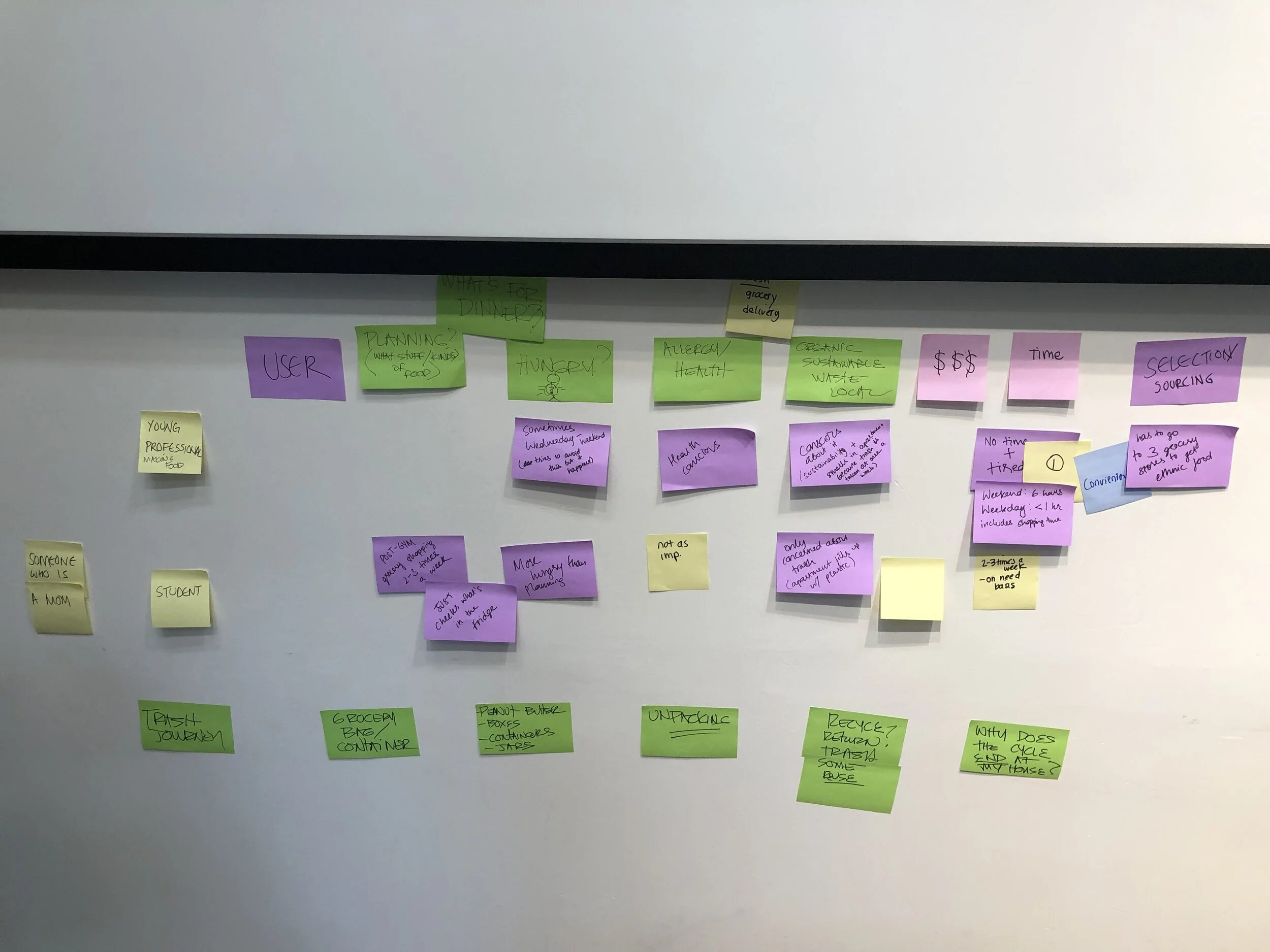
Since all of us had different experiences with food delivery, we decided to start by creating a series of journey maps in order to look at how different demographics approached the process.
Journey Mapping
Each member on my team chose a different demographic to map out their food delivery journey; I worked on the journey of a student while others worked on that of a young working professionals, of stay-at-home mothers, and of teenagers living with their parents.
We ended up choosing young working professionals as our target demographic because their journey map fit best with the prompt and they also made up a big portion of the food delivery consumer base.
What type of food delivery?
After determining our target demographic, we were left with a major decision regarding what type of food delivery we wanted to tackle; since the prompt did not specify, we could either choose to tackle food delivery from restaurants (UberEats, Postmates) or food delivery from local grocers and supermarkets (Blue Apron, Instacart).
After some deliberation, we decided to tackle food delivery in the form of ingredients, and more specifically meat, because we determined that this type of delivery produced a lot more waste in comparison to the other options. Meat is also one of the ingredients most detrimental to the environment during its production and shipment.
With a target demographic and a definitive situation in mind, we were able to revise the original HMW statement into one that was more specialized and easier to work with.
HMW help young professionals get meat delivered with zero waste?
Ideation
Our first step of ideation was to figure out the different roles packaging played in regards to the produce. We came up with a few different ones, including perish-ability, portioning, and transportation; after we came up with this “roles”, we started thinking about solutions that highlighted each role.
We used a lot of sticky notes to add on to each other’s ideas while brainstorming and ended up creating a map of ideas sorted by the “role” they highlighted.
Some notable solutions were:
A device, when inserted into the meat, would help regulate temperature and freshness,
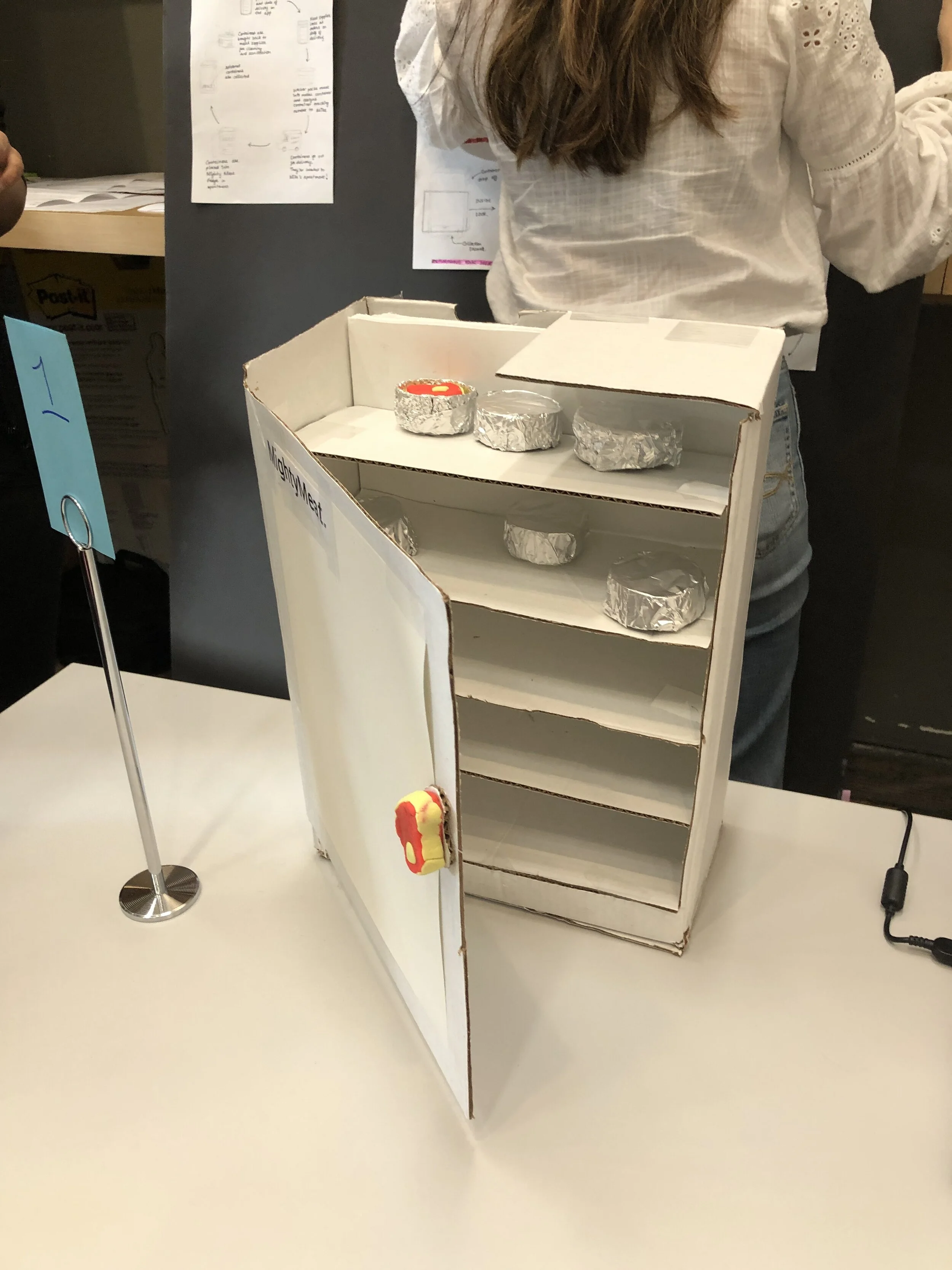
A communal fridge within apartments where meat is delivered in reusable containers through a mobile application,
and biodegradable containers that would melt after the meat was taken out.
We decided to go with the second solution because it was the most viable and was also the option that seemed to embody a majority of the “roles” we had selected.
Mighty Meat
Now that we had our idea, it was time to start prototyping.
Our solution consisted of three parts: a physical communal fridge, metal containers, and a companion app which worked together to provide the cyclical, zero-waste, service for our users.
We named the service Mighty Meat and also came up with a quick “logo” for some simple branding. For the rest of the event, the other people on my team worked on prototyping the service and fridge while I worked on the mobile application with the graphic designer.
The service
A young working professional would put in their meat order and date of delivery on the app.
Meat supplier looks at all the orders on day of delivery.
Butcher packs meat into the metal container and assigns container tracking number to customer.
Containers go out for delivery.
Containers are placed into the communal fridges.
Empty containers are collected.
Containers are brought back to meat suppliers for cleaning and sanitation.
Rinse and Repeat.
The Fridge
The fridge would be dropped off at an apartment complex and would be placed within a common area. This would allow people to easily access it and to return their containers when they are finished with the meat.
The Containers
The containers are made out of metal and would be air-tight to ensure the freshness and quality of the meat stored within them. They are portable and easy to transport so that they can easily be put into fridges and retrieved for sanitation.
The Application
I started off building the application with a few low-fidelity wire-frames. With the amount of time we had, I decided the most important pages to mock-up were the order/sales pages, the catalog pages, and the production workflow pages.
On the wire-frames I fleshed out the features, the UX, and also outlined the layouts of the pages.
Final Deliverables
The Fridge + Containers
My other team members were able to build a fridge replica out of cardboard and container replicas out of some tinfoil. We tried to mimic the pickup/drop off user flow and made it so that the containers could be retrieved from a flap in the back.
The Application
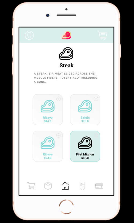
Working with the graphic designer, I was able to mock up a high-fidelity version of the customer user flow. We used applications like Blue Apron and UberEats as inspiration, but also added our own twist to fit the situation. We were able to complete all of the different pages including the landing page, browsing page, ordering/payment page, and also a confirmation page.
I also wanted to illustrate the grocer’s side of the application, so we also mocked up a grocer user flow; the pages we built included the landing page, inventory page, and also a sanitation confirmation page. If you would like to check out the full, interactive prototype please click here.
Final Thoughts
By the end of the seven hour event, our team had managed to finish both prototypes and build a poster board as well. We were able to present to all the other participants and the mentors who were there. Many people had fun interacting with the mobile and physical prototypes as they simulated the user flow.
If we had more time, I would have loved to conduct some user-testing to see how our prototypes would fare with real customers and also how it would test with grocers. This was a great learning experience and taught me a lot about working with very different people together with very different personalities. I hope that I will be able to continue working on amazing challenges like this and to take what I have learned to create more interesting products in the future.


